
.svg "LTN-logo-white (1)")
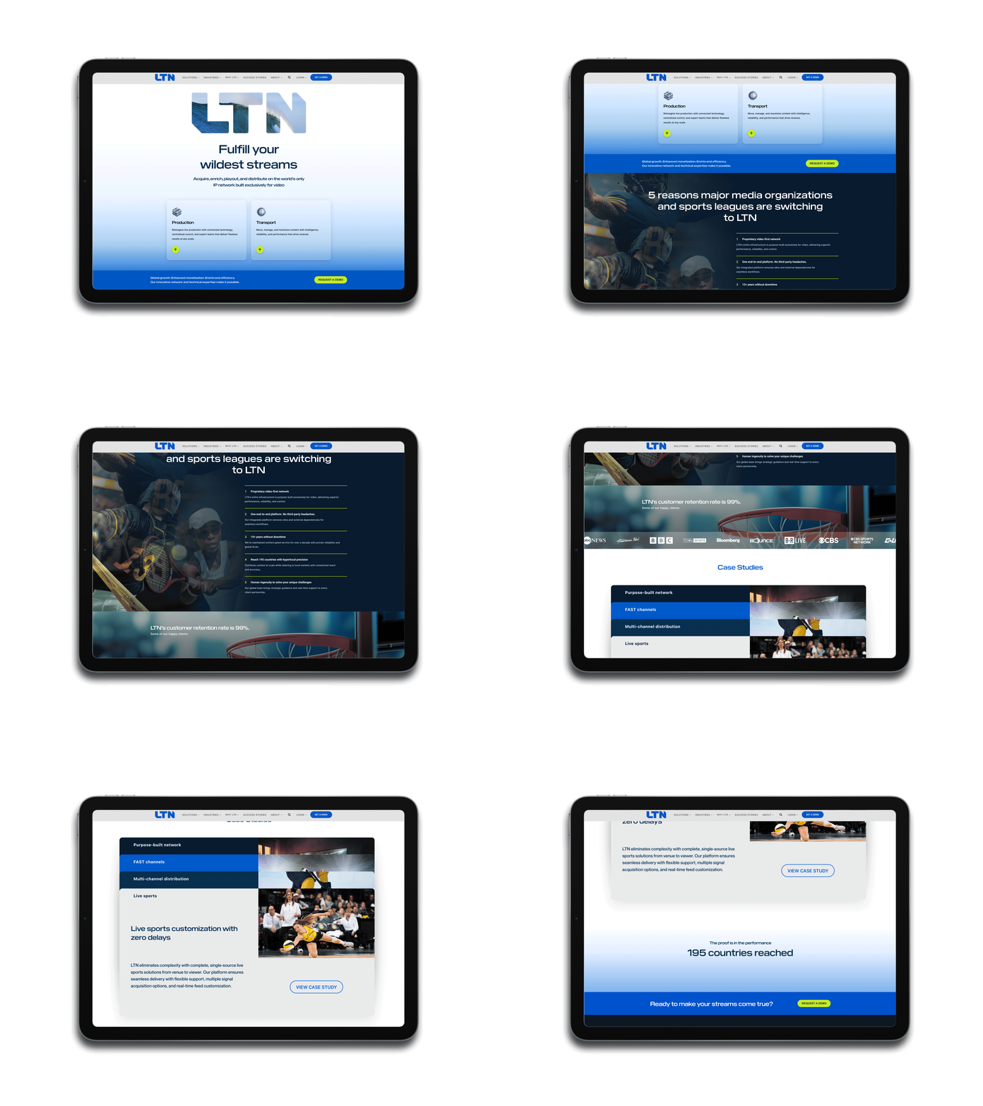
A product ecosystem that had outgrown its website
LTN's technology moved faster than its website could explain it. Over the years, the company had built a genuinely powerful, purpose-built video network — but the products living on top of it were named and organized the way engineering teams talk to each other, not the way buyers shop.
Names like Wave, Arc, and Lift were metaphorical and memorable internally, but told a prospect nothing about what the product did. The visual identity leaned soft and decorative — pastel tones with a Miami-vibe warmth — which undersold LTN's position as the mission-critical infrastructure partner behind the world's biggest broadcasters and sports leagues.
LTN brought BOL in to rebuild the experience end to end: the product architecture underneath it, the navigation that exposes it, and the visual system that carries it. The goal wasn't a redesign for its own sake — it was making an already-strong platform finally legible to the people buying it.
The ChallengeA house of brands, not a brand house
Research, stakeholder interviews, and a full data deep-dive surfaced a consistent pattern:
- Products were organized by internal history, not customer need — only people who worked closely with LTN understood that some products (like Arc) were stand-alone while others could be purchased and deployed together.
- Metaphorical product names (Wave, Arc, Lift, Flex, Cue, and others) required constant sales education and carried no brand recognition with prospects.
- The site's structure looked like a set of disconnected solutions rather than a true, customizable ecosystem — leaving "what's a product versus a solution?" unanswered for visitors.
- The visual identity didn't match the buyer: LTN's real audience skews toward decision-makers who don't need every technical detail, but do need to trust, at a glance, that they're looking at serious broadcast-grade technology.
- The roadmap was moving — some legacy products were sunsetting, new ones were launching — and the existing structure had no room to absorb that change without confusing the market further.
To fix the website, BOL first had to fix what the website was describing.
The StrategyStart with the business, not the pixels
1. A Cross-Functional Naming and Architecture Workshop
Before any design work began, BOL ran a structured workshop with LTN's own sales team — the people closest to how deals actually get won. The exercise combined three data sources into one mapping process:
- Sales opportunity data — win rates and close-date analysis to see how internal teams actually classified and sold each solution.
- SEO and keyword trends on ltnglobal.com — what prospects search for, how often, and where competitors were capturing traffic LTN was losing.
- 6sense intent data — keyword-level buying signals from LTN's own target account list and site visitors over a 90-day window.
Working session by session — including literal whiteboard mapping with the LTN team — the group sorted every product, feature, and capability into two customer-facing buckets: Production and Transport, supported by a shared Metadata layer, all running on LTN's purpose-built network.
2. From House of Brands to Branded House
The prior ecosystem was full of names like Wave, Arc, Lift, Flex, Connect, Cue, and Target — a dozen-plus metaphorical product names that only made sense with a sales rep in the room. The workshop replaced that with a consistent, function-forward system: a small number of clear customer-facing categories, each simply prefixed with LTN.
The result plays out live on ltnglobal.com today: solutions are grouped under two clear families — Production and Transport — each with named, self-explanatory offerings (LTN Master Control; LTN Channel Creation, Contribution, Distribution, and Live Streaming) that a buyer can understand without a sales call.
3. Navigation Built Around Buyer Logic, Not Org Charts
The new site map mirrors how customers actually think about the problem — Production or Transport — instead of how LTN's internal teams were structured. That gave the roadmap room to breathe: legacy names could sunset and new products could launch into an existing, logical structure instead of bolting on as one more oddly-named tile.
4. A Visual Identity Built for a Tech-Forward Broadcast Leader
The old homepage looked like most enterprise infrastructure sites: safe, dark, and interchangeable. BOL rebuilt it around a signature visual device and a voice that actually sounds like a brand, not a compliance checklist.
The Creative"Fulfill your wildest streams"
Fulfill your wildest streams
— LTN homepage, hero headline
The tagline plays on both meanings of "streams" — live video streams and the ambition behind them — and gave BOL a flexible creative platform to carry across the redesigned site. The masked-logo treatment recurs throughout, filled with sports and live-event footage (basketball, football, baseball, volleyball) that ties LTN's brand mark directly to the live moments its network delivers, without ever feeling like decoration for decoration's sake.
The Rebuilt ExperienceIn market
- Homepage now leads with two clear, animated entry points — Production and Transport — each expanding into named, function-first solutions instead of a wall of undifferentiated tiles.
- The solution names recommended in the workshop are live on ltnglobal.com today: LTN Master Control, LTN Channel Creation, LTN Contribution, LTN Distribution, and LTN Live Streaming.
- A single, consistent LTN-prefixed naming convention now spans the entire product ecosystem, closing the brand cohesion gap versus category competitors like Zixi, Avid, and Amagi.
- The visual system — bright, editorial palette, the photo-filled logotype, and scroll-driven motion — repositions LTN as a modern, tech-forward infrastructure company rather than a legacy broadcast vendor.
- The new architecture is built to flex: the site map can absorb sunsetting products and new launches without disrupting the buyer's mental model of Production versus Transport.
It started with the business problem, not the interface. A workshop grounded in sales data, SEO trends, and intent data meant the new architecture reflected how deals actually get made — not just how the site looked.
It replaced metaphor with clarity. Function-forward naming (LTN + what it does) removed the need for constant sales education and gave the brand a naming convention it can scale into future products.
It reorganized around the buyer, not the org chart. Production and Transport map to how customers evaluate the problem, giving every product a logical home and every prospect a faster path to understanding.
It made the brand feel as advanced as the technology. Richer color, motion, and an interactive homepage module finally match the sophistication of LTN's actual network and platform.
It built room for what's next. A flexible naming and architecture system means new products and sunsetting products can move through the site without ever confusing the market again.
The Bottom LineLTN didn't just need a better-looking website — it needed its own product story to make sense to the people buying it. With BOL's workshop-driven approach, LTN now has:
LTN's technology was always ready for this moment. Now its website is too.
If your product story hasn't caught up to your product, that's a strategy problem before it's a design problem. Let's build it together.